Obama Foundation Uses WordPress – And So Can You
There’s a certain amount of satisfaction that comes with knowing the most technologically sophisticated president in our history uses our favorite CMS. Looking good Obama Foundation.

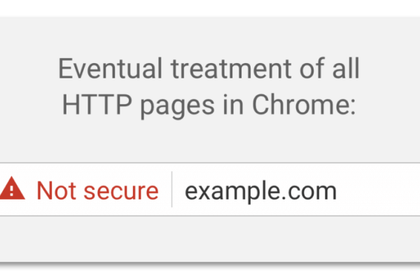
New Google Chrome Labels Your Site Insecure If You Don’t Use HTTPS
In the past, websites that didn’t use sensitive information often were left unsecured, which means they didn’t use HTTPS (SSL). Google’s release of Chrome 56 is the first step in actively notifying your visitors when they are viewing a non-secure page. You can learn how it pertains to your WordPress site on Wordfence. Eventually any page that doesn’t use HTTPS/SSL will activate a warning to your visitors, potentially compromising your brand trust. For this reason Brewhouse’s web development team will be moving away from using plain HTTP.
Website Design Philosophy: Utility

When navigating the multitude of design decisions required for building a website, we have found enormous value in a handful of tenets. We’ve assembled them into a web design philosophy that helps us and our clients understand what the heck we’re aiming for.
Perhaps ironically, one of our key design tenets is utility. Brewhouse sets its web development apart through our focus on fine design, but that doesn’t mean we sacrifice utility for beauty. We balance attractive design with an understanding that your audience visits your website not to appreciate a beautiful web design but to gather information. At the end of the day, design is a vehicle for delivering your message.
Throughout a project we encourage our clients to review our work by asking “does this design solution advance my message?”. Every element—the icons, typography, color palette, scale, white space—must have a purpose. We don’t do fluff. This doesn’t mean we don’t like big imagery or tasteful scroll animations. We do. As long as they enforce your message.
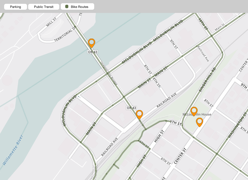
One great example of Brewhouse’s commitment to utility is in our work with Downtown City Association. We designed an interactive map that presents an enormous amount of information without overwhelming the viewer. Each element provides the user with an opportunity to explore and discover the information they’re looking for. https://downtownoregoncity.org/explore-downtown/
Alliant Systems — New Website, New Office
 Alliant Systems is one of Portland’s leading mechanical contractors who has built some of the most advanced building systems around. Portland prides itself in creating energy efficient work spaces. Alliant is a big reason for that.
The firm recently grew out of its Beaverton office space and chose to move into a beautifully renovated, Pearl District building. As part of the move, they wanted to modernize their website. The new site we designed is mobile friendly and shows off stunning photography of their projects. We also got the added bonus of taking employee portraits, black and white on a clean background, which we think helps show off the great people who work there.
Congratulations to Mayer/Reed

Our friends at Mayer/Reed were voted number 3 on the Daily Journal of Commerce’s A List of Oregon Landscape Architects. Congratulations you guys. And also congratulations for being on the winning design team (along with Snøhetta and DIALOG) that will be creating the Willamette Falls River Walk in Oregon City. Read more about this incredible redevelopment and design opportunity on the Willamette Falls Legacy Project website. The falls is one of the largest by volume in the country and has been inaccessible to the public for decades. The river walk project will change that.
How to Shorten a URL
We review our clients’ websites periodically to ensure all is working well and often find ourselves distracted by the interesting content they are posting. While reading a recent blog post of a general contractor I noticed the use of long URLs when referring the reader off site. These tend to break up the flow of the article, but it is an easy problem to solve using Bitly or Google’s URL Shortener.
