Website Design Philosophy: Utility

When navigating the multitude of design decisions required for building a website, we have found enormous value in a handful of tenets. We’ve assembled them into a web design philosophy that helps us and our clients understand what the heck we’re aiming for.
Perhaps ironically, one of our key design tenets is utility. Brewhouse sets its web development apart through our focus on fine design, but that doesn’t mean we sacrifice utility for beauty. We balance attractive design with an understanding that your audience visits your website not to appreciate a beautiful web design but to gather information. At the end of the day, design is a vehicle for delivering your message.
Throughout a project we encourage our clients to review our work by asking “does this design solution advance my message?”. Every element—the icons, typography, color palette, scale, white space—must have a purpose. We don’t do fluff. This doesn’t mean we don’t like big imagery or tasteful scroll animations. We do. As long as they enforce your message.
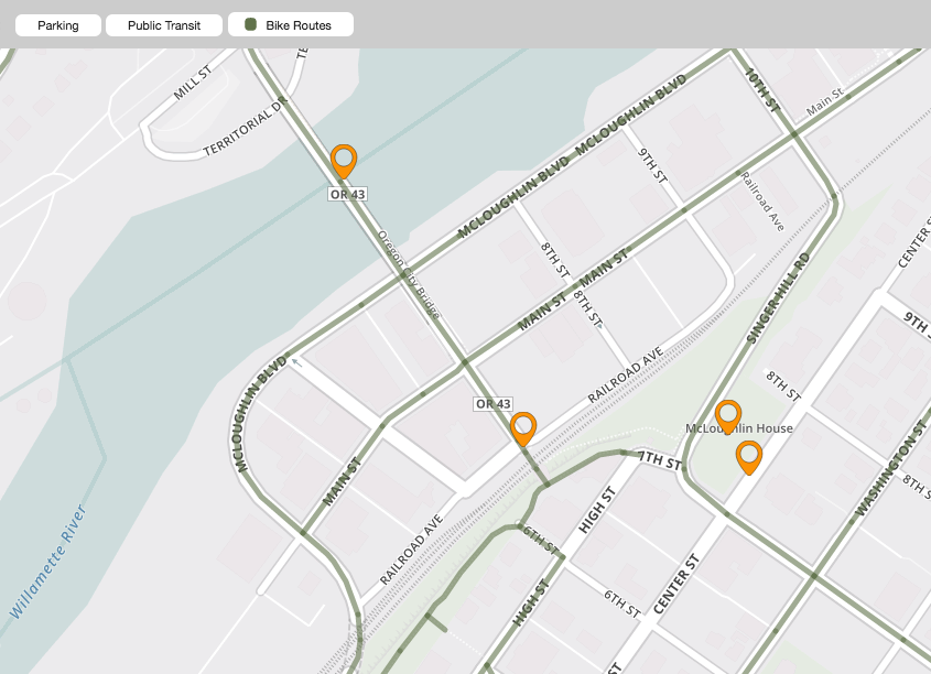
One great example of Brewhouse’s commitment to utility is in our work with Downtown City Association. We designed an interactive map that presents an enormous amount of information without overwhelming the viewer. Each element provides the user with an opportunity to explore and discover the information they’re looking for. https://downtownoregoncity.org/explore-downtown/

